Okay so I actually started this project 5 weeks ago, but due to certain circumstances it took me a while to get good copies of my Australia photos to make into postcards.
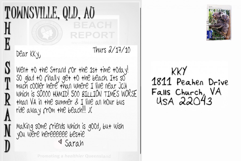
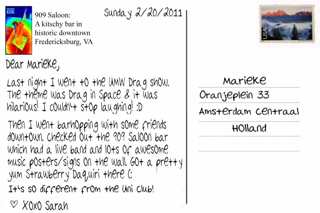
So here is week 1 of my Australia and US postcards. This starts with my first full week in Australia and I plan on continuing this project until beginning July when I left Australia. I am doing this as a way to compare my life in OZ to my life here.
I wanted to exactly match my postcards for this project and the week in which I took them, but the devil has my soul this semester and I have a billion things to do for my other classes. D: (this emoticon doesn’t begin to convey my stress!)
I’ve decided to make the postcards more of a secondary final project (less pressure on me to get it done) and focus my most attention on the daily shoots/ all the other homework I have for my other classes. I like making the postcards but they take sometime to make, hence why they are on the back burner for now.


Creation Process:
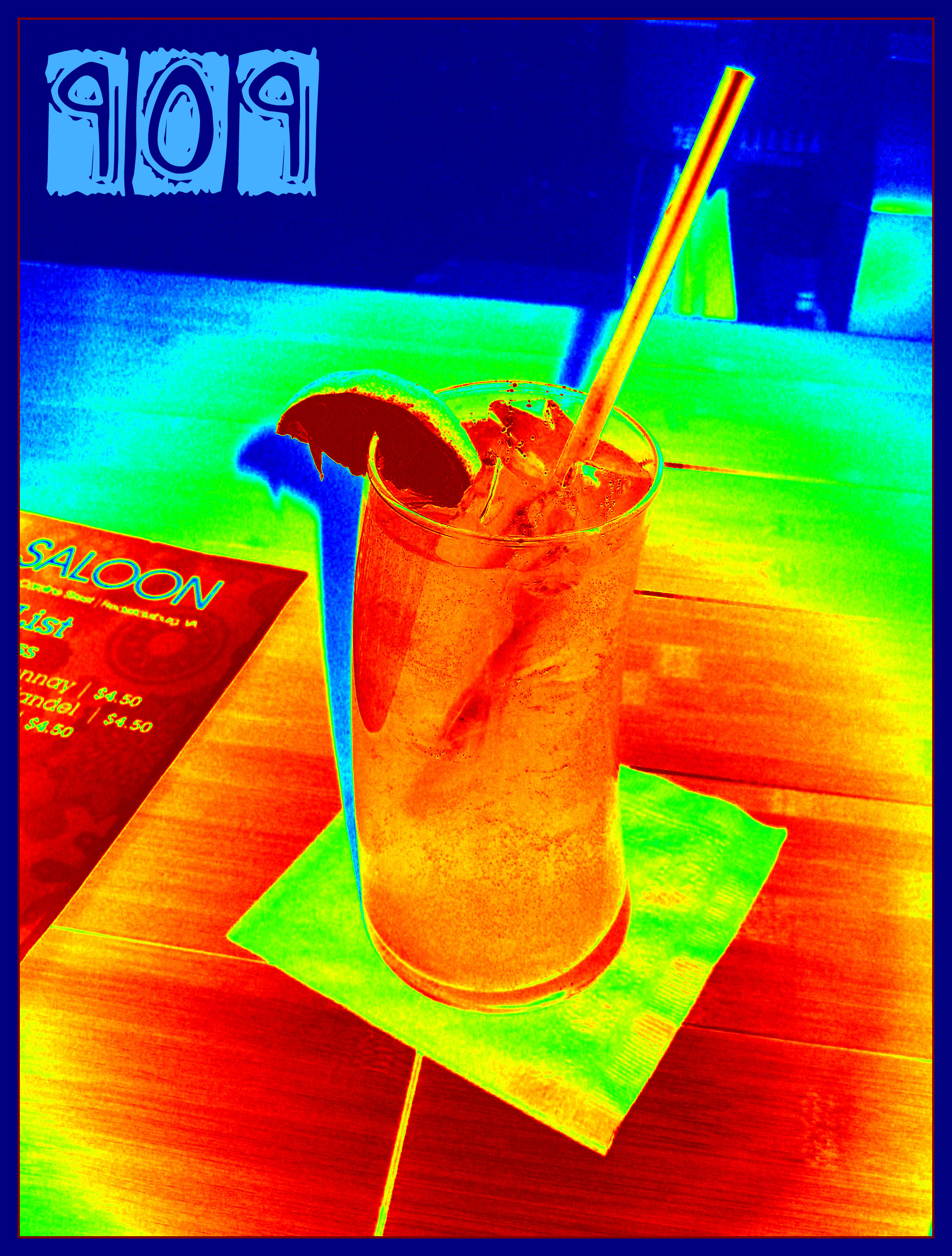
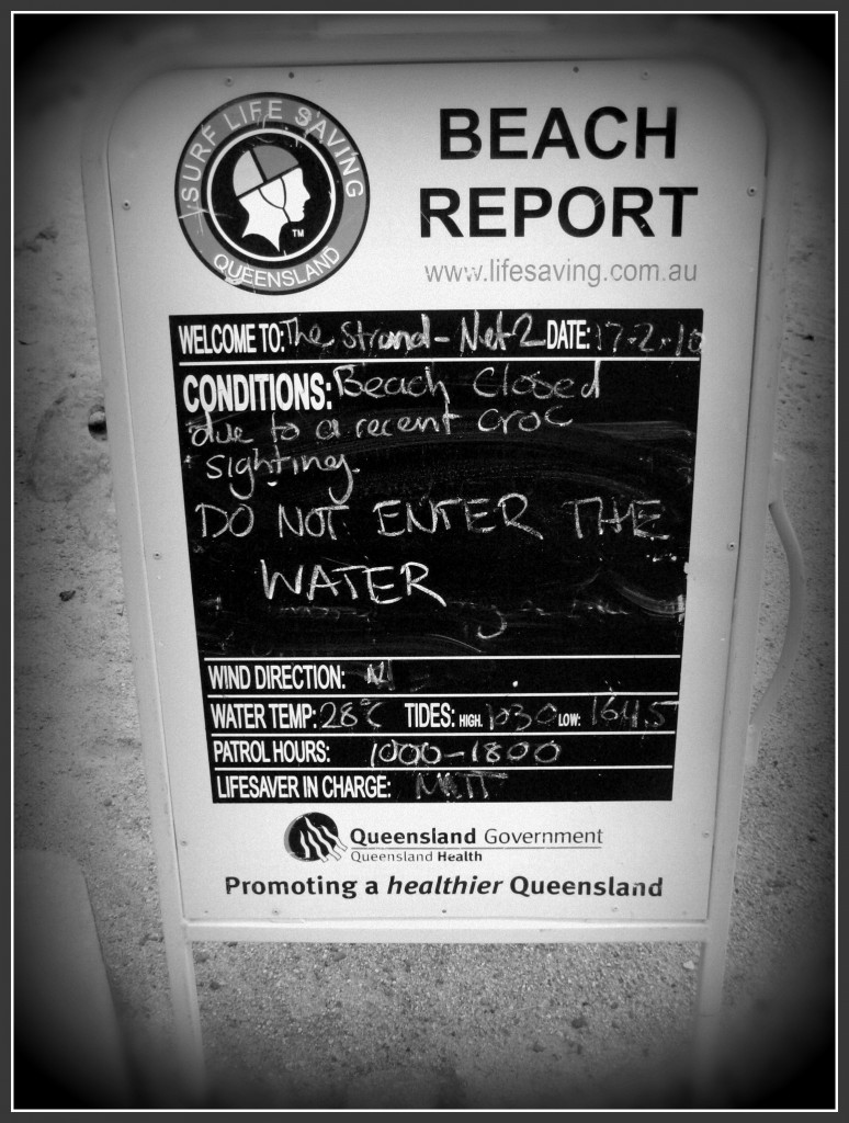
So I started by finding the photo that I wanted to use for each postcard and then editing it in Picnik by intensifying the colors, adding words and also a border around the card. Once that was done, I created the content of the photo using Photoshop.
All of these postcards are addressed to friends who if these postcards were “real” I would send it to them. The stamps are real stamps from each country which I took a photo of and then photoshopped these stamps into a new document.
The handwriting is actually my own handwriting which I created using this really awesome program called Pilot Handwriting.
Through Pilot Handwriting I write out each letter of the alphabet and upload to the website which then processes the letters so that I can I can type out a message.
Now this isn’t exactly my handwriting which is more a cursive-y print, but it’s a very close approximation of it, which is cool.
There are a few drawbacks to the program, such as I can’t download my handwriting as a font for my computer. This means that I have to always go to the website, type out my message then do a screen shot of my message and paste that into the photoshop document I’m working on. Thus, I’m stuck with the black text color for all my postcards. This also takes a lot more time to put on my postcard that it would if I used a normal handwriting font.
Also, when I first wrote out all the letters to upload to Pilot handwriting, it was hard to make sure that each letter was the correct size. Take a look at the postcard from the 909 Saloon. If you look closely the letter E is HUGE is comparison to the other letters. This is because I wrote it to0 big and didn’t really want to fix it at the time. It’s passable for what I’m doing, but it kinds of irritates me.
I have 4 other postcards 100% done which I made using pilot handwriting and I have several others half done. For my future postcards I’m thinking about handwriting the messages I want to use because that would be a lot faster. It might also encourage me to do more in the small chunks of free time I have.
Will hopefully post more of them soon!


